CSS utility classes
Combine easy-to-read names with semantic HTML elements.
CSS framework · official guide
Learn to build pages with descriptive CSS classes—from your first paragraph to interactive components and complete layouts.
Combine easy-to-read names with semantic HTML elements.
Each section explains the classes with examples you can adapt.
Filter the available classes directly from the CSS stylesheet.
A note before you begin: Thanks for using TrummerWork. The framework is still in development, but you can already start building with our CSS classes. If you have any questions or feedback, feel free to contact us. Contact page
01 · Getting started
In this project, the framework is used as static files. Download the files and copy style.css and, if you plan to use interactive components, script.js into your project (the folder containing your index.html).
Two ways to include the framework
You can link to local project files or load them from the official CDN. In either case, make sure the paths are correct.
Add the CSS stylesheet in the <head> and the script before the closing </body>. The stylesheet provides styles and utilities; the script enables interactive components such as the navbar and sliders.
<!doctype html>
<html lang="en">
<head>
<meta charset="utf-8">
<meta name="viewport" content="width=device-width, initial-scale=1">
<meta name="description" content="My site built with TrummerWork">
<link rel="stylesheet" href="https://trummerwork-project.web.app/style.css">
<title>My project</title>
</head>
<body class="texto-inter fondo-blancolight">
<h1 class="titulo titulo-grande texto-primario">Hello, TrummerWork</h1>
<p class="texto texto-mediano">My first page with the framework.</p>
<script src="https://trummerwork-project.web.app/script.js"></script>
</body>
</html>If you downloaded the files and saved them beside your HTML, replace the example paths with these local references:
<link rel="stylesheet" href="style.css">
<script src="script.js"></script>style.css: base styles, variables, utilities, components, and responsive rules.script.js: slider behavior and responsive menu closing. Include it when using these interactive components.02 · How it works
A CSS class is written in the class. You can combine multiple space-separated classes: for example, one sets the size, another the color, and another the alignment.
This paragraph combines three utilities.
<p class="texto-centro texto-primario texto-negrita texto-grande">
This paragraph combines three utilities.
</p>03 · Typography
TrummerWork combines HTML heading elements with classes for size, font family, color, alignment, and emphasis. Choose the semantic hierarchy based on the content, then add visual classes.
A subtitle to introduce a section.
A normal-sized paragraph with bold emphasis y italics.
Small text for notes and metadata.
<h1 class="titulo titulo-largo texto-primario">Long heading</h1>
<h2 class="titulo titulo-grande">Large heading</h2>
<h3 class="titulo titulo-mediano">Medium heading</h3>
<h4 class="titulo titulo-pequeño">Small heading</h4>
<p class="subtitulo">A subtitle for a section.</p>
<p class="texto texto-mediano">
Text <span class="texto-negrita">highlighted</span>.
</p>Extra-small text · texto-muy-pequeño
Small text · texto-pequeño
Medium text · texto-mediano
Large text · texto-grande
Very large text · texto-muy-grande
Inter · Ideas that become projects.
Lato · Ideas that become projects.
Merriweather · Ideas that become projects.
Poppins · Ideas that become projects.
Bebas Neue · Ideas that become projects.
texto-inter · texto-lato · texto-Merriweather · texto-poppins · texto-bebasneue
Start-aligned · texto-inicio
Center-aligned · texto-centro
End-aligned · texto-final
Uppercase text · texto-mayusculas
LOWERCASE TEXT · texto-minusculas
capitalized example text · texto-capitalizado
Underlined text · texto-subrayado
Bold text · texto-negrita
Italic text · texto-cursiva
Shadowed text · texto-sombra
04 · Color and surfaces
Color classes let you apply brand or common colors. Check the CSS for specific names and values; contrast depends on the combination and should be checked in context.
fondo-primario
texto-blanco
fondo-secundario
texto-blanco
fondo-gris
texto-negro
<p class="texto-primario">Text in the primary color</p>
<div class="fondo-azul texto-blanco padding-mediano">
Light text on a blue background
</div>
<span class="texto-resaltado texto-resaltado-amarillo">
An important word
</span>The swatch shows the applied text color.
Each swatch uses the specified background class.
Apply texto-resaltado with a variant to highlight short passages:
05 · Layout
First decide how much room your content needs. Container classes control width; height classes control how tall an element is.
Use these classes on the element that contains your section:
contenedor — centers content and limits its maximum width to 1160 px.contenedor-small — uses 25% of the available width.contenedor-medium — uses 50%.contenedor-large — uses 75%.contenedor-completo — uses 100% and removes the maximum width.Percentage variants are calculated relative to the parent element. On mobile, the CSS adjusts size variants to use the available width.
Apply one of these classes to the element whose height you want to set:
altura-auto — lets the content determine its height.altura-completa — uses 100% of the parent’s height.altura-pantalla — uses the viewport height.altura-mini — 4 rem.altura-pequeña — 8 rem.altura-media — 12 rem.altura-large — 18 rem.altura-max — 25 rem.A fixed height may crop content or leave empty space when the content changes. Check the result at different screen sizes.
<main class="contenedor">
<section>
<h1 class="titulo titulo-grande">My project</h1>
<p>The container centers this section and limits its width.</p>
</section>
</main>Grid divides space into rows and columns. Add display-grid to the parent and a column class to choose how its children are arranged.
columna-2 — two columns.columna-3 — three columns.columna-4, columna-5 y columna-6 — four, five, or six columns.The classes fila-1 a fila-6 define one to six grid rows.
The framework breakpoints reduce the number of columns in several grids on small screens. See the responsive section for details.
A block inside the grid.
Another block using the same pattern.
The grid adapts on narrow screens.
<section class="display-grid columna-3 espacio-entre-2">
<article class="tarjetas fondo-blanco">
<div class="contenedor-cuerpo-tarjeta">
<h2 class="titulo titulo-pequeño">Project A</h2>
<p>Project description.</p>
</div>
</article>
<!-- Repeat the article for more items -->
</section>Flexbox arranges items in a row or column. Enable it on the parent and combine classes for direction, alignment, and spacing.
fila / fila-reversa — horizontal order.columna / columna-reversa — vertical order.inicio, centro-horizontal y final — align along the main axis: horizontally in a row and vertically in a column.arriba, centro-vertical y abajo — align along the cross axis relative to the selected direction.centrado — centers along both axes.espacio-entre-1 a espacio-entre-6 — increases the space between items.crecer-1 a crecer-6 — lets a flex item fill the remaining space.Add display-flex to the parent. Direction, alignment, and spacing classes belong on that parent; crecer-* goes on the child that should fill the remaining space.
<div class="display-flex fila centro-vertical espacio-entre-2">
<span>Team name</span>
<a class="link" href="#proyectos">View projects</a>
</div>06 · Visual adjustments
Margin creates space outside the element, separating it from its surroundings.
Container area
margen-arriba y margen-abajo — 10 px on one side.margen-izquierdo y margen-derecho — 10 px on one side.margen-vertical y margen-horizontal — spacing on both sides of the axis.margen-0 — removes the margin.Padding creates space inside the element, between its content and its border.
Measurements are defined in the CSS; use the preview to compare the space each class takes up.
Combine borde with a radius class to change the shape of the corners.
borde — adds a solid border.borde-redondo-pequeño, borde-redondo-mediano y borde-redondo-grande — round the corners with progressively larger radii.borde-circulo — applies a 50% radius; use it on square elements to create a circle.These classes control whether an element appears on the page.
mostrar — displays the element as a block.oculto — removes the element from the layout.ocultar-celular — hides it at the framework’s mobile breakpoint.07 · Ready-to-use components
Components combine familiar HTML structure with framework classes. The Nexo is a real project example: it combines a navbar, hero slider, cards, a form, and a footer.
The boton class adds shape and interaction. Add boton-primario or boton-secundario for color. Use a button to perform an action and an a link to navigate. link is a link style for secondary actions within the content.
<button class="boton boton-primario texto-blanco" type="button">
Save
</button>
<a class="boton boton-secundario texto-blanco" href="#contacto">
Contact
</a>
<a class="link" href="#detalles">View details</a>tarjetas forms the container. contenedor-cuerpo-tarjeta groups text and actions; tarjetas-imagen and tarjetas-imagen-completas are image variants. tarjeta-ancha offers another presentation style. Place cards in a grid and test their width with real content.

<article class="tarjetas fondo-blanco">
<img class="tarjetas-imagen" src="foto.jpg" alt="Description">
<div class="contenedor-cuerpo-tarjeta">
<h2 class="titulo titulo-pequeño">Project title</h2>
<p class="texto texto-mediano">Description breve.</p>
<a class="link" href="#proyecto">View project</a>
</div>
</article>formulario-simple creates a vertical form. Use labeltxt for labels, form-input for fields, message-input for long text, and send-boton for the action. Associate each label with a control id.
<form class="formulario-simple">
<label class="labeltxt" for="correo">Email</label>
<input class="form-input" id="correo" type="email" required>
<label class="labeltxt" for="mensaje">Message</label>
<textarea class="message-input" id="mensaje"></textarea>
<button class="send-boton" type="submit">Send</button>
</form>Visual only
This form does not send or save data. In a real project, implement the server and explain how the data is processed.
aviso and titulo-aviso are used for status messages. Combine them with framework backgrounds and text colors. cita displays a note or quote; its sizes are cita-pequeña, cita-mediana, and cita-grande. divisor creates a divider.
Information alert
This component can highlight a useful recommendation or status.
“Good design helps people understand content.”
<aside class="aviso fondo-azul texto-blanco">
<p class="titulo-aviso">Information alert</p>
<p>Clear, concise text.</p>
</aside>
<blockquote class="cita cita-pequeña">
A quote or recommendation.
</blockquote>The framework includes five track-based variants and a compact carousel with its own structure. Each example below can be tested and copied in full. Load script.js to enable autoplay, controls, and indicators. The examples in this guide reduce their height and rearrange text demonstrations on narrow screens so they do not overflow their cards.
slider-basico, slider-con-indicadores, slider-fundido o slider-zoom). slider-hero is a hero presentation and can be combined with one of them. slider-compacto is standalone and does not use the track structure.
Slides move horizontally and advance automatically. Previous and next buttons are optional.
<!-- Container and horizontal scrolling variant -->
<div class="slider slider-basico">
<!-- Track moved by JavaScript to change slides -->
<div class="slider-pista">
<!-- Each article is a slide; here it is paired with a background -->
<article class="slider-diapositiva fondo-azul">
<h2 class="titulo titulo-mediano texto-blanco">First slide</h2>
</article>
<!-- Duplicate this article to add another slide -->
<article class="slider-diapositiva fondo-verde">
<h2 class="titulo titulo-mediano texto-blanco">Second slide</h2>
</article>
</div>
<!-- Optional previous control -->
<button class="slider-anterior" type="button"
aria-label="Previous slide">‹</button>
<!-- Optional next control -->
<button class="slider-siguiente" type="button"
aria-label="Next slide">›</button>
</div>Add the slider-indicadores container. The script creates one button per slide; the dots let users jump directly to any slide.
<!-- Variant that automatically generates navigation dots -->
<div class="slider slider-con-indicadores">
<!-- Track containing all slides -->
<div class="slider-pista">
<!-- First slide -->
<article class="slider-diapositiva fondo-primario">
<h2 class="titulo titulo-mediano texto-blanco">First slide</h2>
</article>
<!-- Second slide -->
<article class="slider-diapositiva fondo-morado">
<h2 class="titulo titulo-mediano texto-blanco">Second slide</h2>
</article>
</div>
<!-- Previous and next controls -->
<button class="slider-anterior" type="button"
aria-label="Previous slide">‹</button>
<button class="slider-siguiente" type="button"
aria-label="Next slide">›</button>
<!-- The script inserts one dot per slide here -->
<div class="slider-indicadores"></div>
</div>Use slider-fundido to transition between slides using an opacity effect.
<!-- Variant that changes slides using opacity -->
<div class="slider slider-fundido">
<!-- The track contains the stacked slides -->
<div class="slider-pista">
<!-- Initial slide -->
<article class="slider-diapositiva fondo-naval">
<h2 class="titulo titulo-mediano texto-blanco">First slide</h2>
</article>
<!-- Next slide -->
<article class="slider-diapositiva fondo-rojo">
<h2 class="titulo titulo-mediano texto-blanco">Second slide</h2>
</article>
</div>
<!-- Optional controls for manual navigation -->
<button class="slider-anterior" type="button"
aria-label="Previous slide">‹</button>
<button class="slider-siguiente" type="button"
aria-label="Next slide">›</button>
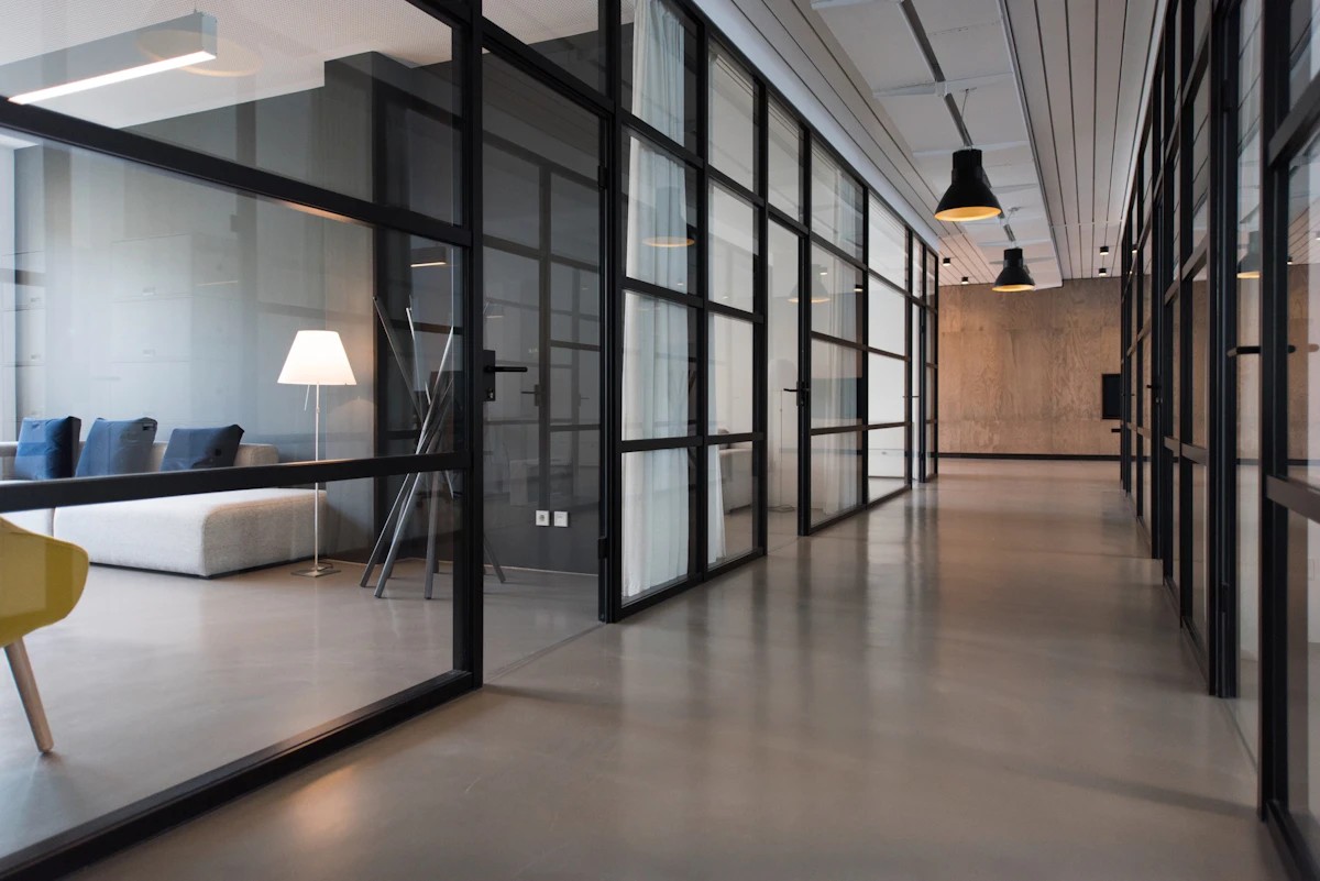
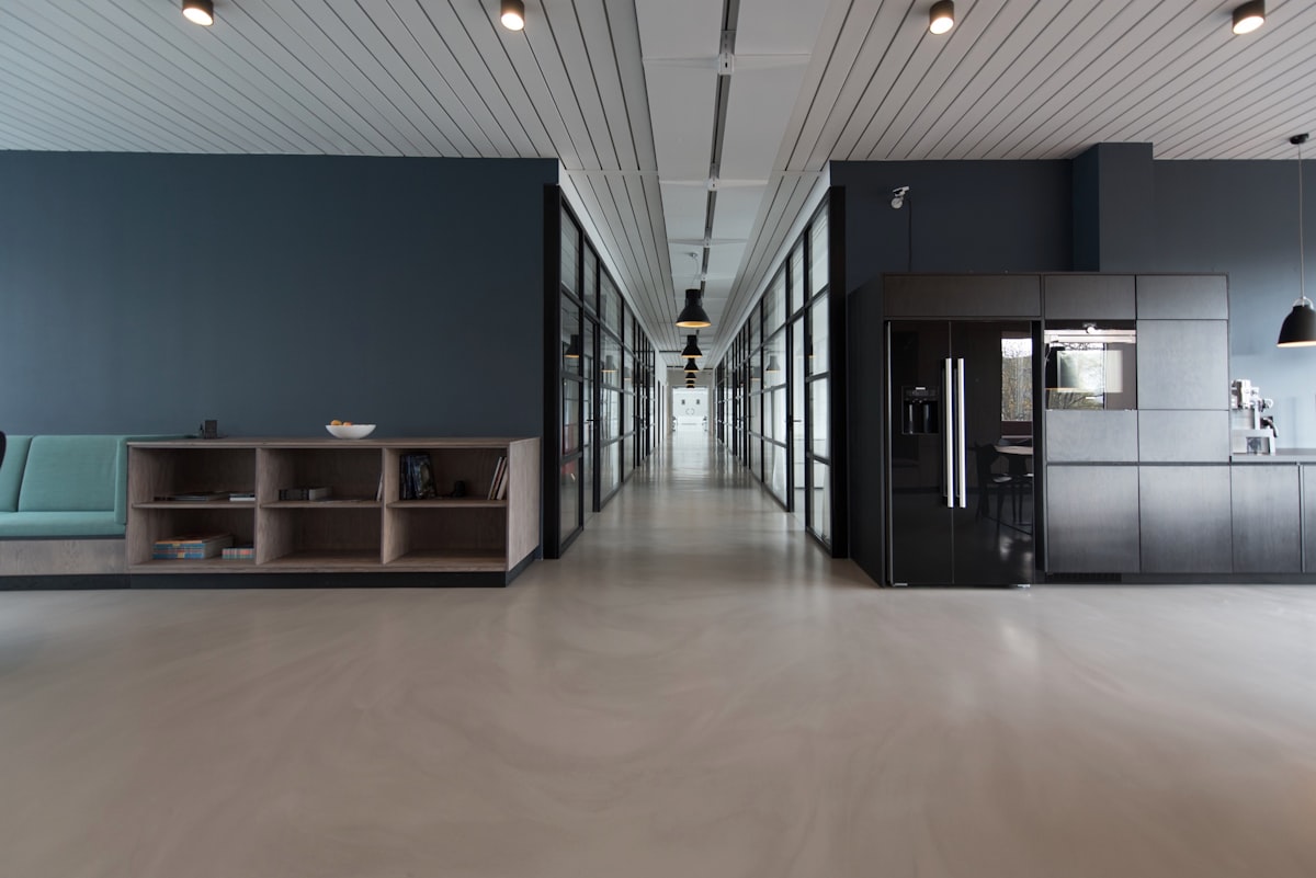
</div>Use slider-zoom with images inside the slides. The script prepares each image and zooms in on the active slide.
<!-- Variante de zoom: necesita imágenes en las diapositivas -->
<div class="slider slider-zoom">
<!-- Track that moves the slides -->
<div class="slider-pista">
<!-- Image with descriptive alt text -->
<article class="slider-diapositiva">
<img src="foto-1.jpg" alt="Description of the first image">
</article>
<!-- Duplicate this structure for each additional image -->
<article class="slider-diapositiva">
<img src="foto-2.jpg" alt="Description of the second image">
</article>
</div>
<!-- Controls for moving forward or backward -->
<button class="slider-anterior" type="button"
aria-label="Previous slide">‹</button>
<button class="slider-siguiente" type="button"
aria-label="Next slide">›</button>
</div>slider-hero is a visual modifier: combine it with a behavior variant, such as slider-con-indicadores. Each image includes alt text and a content overlay.


<!-- Hero combina indicadores con el formato large de portada -->
<section class="slider slider-con-indicadores slider-hero"
aria-label="Main presentation">
<!-- Track containing the hero scenes -->
<div class="slider-pista">
<!-- Scene: background image and overlaid text -->
<article class="slider-diapositiva">
<img src="foto-portada-1.jpg" alt="Description de la primera escena">
<!-- Choose a style and position for the text -->
<div class="slider-texto slider-texto-oscuro slider-texto-izquierda-abajo">
<p class="texto-mayusculas texto-blanco">Introductory phrase</p>
<h1 class="titulo-largo texto-blanco">Hero headline</h1>
<p class="texto-grande texto-blanco">Brief project description.</p>
<a class="boton boton-primario texto-blanco" href="#contenido">
Learn more
</a>
</div>
</article>
<!-- Another scene can use a different style and position -->
<article class="slider-diapositiva">
<img src="foto-portada-2.jpg" alt="Description de la segunda escena">
<div class="slider-texto slider-texto-vidrio slider-texto-centro">
<h2 class="titulo-grande texto-blanco">Another key idea</h2>
<p class="texto-grande texto-blanco">Another brief message.</p>
<a class="boton fondo-verde texto-blanco" href="#contenido">
View details
</a>
</div>
</article>
</div>
<!-- Controls for navigating between scenes -->
<button class="slider-anterior" type="button"
aria-label="Previous slide">‹</button>
<button class="slider-siguiente" type="button"
aria-label="Next slide">›</button>
<!-- The script creates the navigation dots -->
<div class="slider-indicadores"></div>
</section>Available overlay styles are slider-texto-oscuro, slider-texto-claro, slider-texto-blanco y slider-texto-vidrio. Available positions are slider-texto-centro, slider-texto-izquierda-arriba, slider-texto-izquierda-abajo, slider-texto-derecha-arriba y slider-texto-derecha-abajo. Combine one style and position with slider-texto.
The slider-texto overlay can be combined with one style and position. These examples show all four visual styles and five available positions.
<!-- The slide positions the image and text overlay -->
<article class="slider-diapositiva">
<!-- Background image with accessible description -->
<img src="foto.jpg" alt="Description of the scene">
<!-- Combine slider-texto + una apariencia + una posición -->
<div class="slider-texto slider-texto-oscuro slider-texto-izquierda-abajo">
<!-- Content title and description -->
<h2 class="texto-blanco">Title over the image</h2>
<p class="texto-blanco">A brief, readable description.</p>
<!-- Optional slide action -->
<a class="boton boton-primario texto-blanco" href="#contenido">
Learn more
</a>
</div>
</article>
<!-- Styles: slider-texto-oscuro, slider-texto-claro,
slider-texto-blanco or slider-texto-vidrio.
Positions: slider-texto-centro, slider-texto-izquierda-arriba,
slider-texto-izquierda-abajo, slider-texto-derecha-arriba
o slider-texto-derecha-abajo. -->The compact slider uses a ul with liitems; initially mark one slide with activeIts controls use the classes slider-compacto-anterior y slider-compacto-siguiente.

<!-- Compact carousel; uses a list instead of slider-pista -->
<div class="slider-compacto">
<!-- Capa opcional de título y descripción sobre las imágenes -->
<div class="slider-compacto-texto">
<h2>Project gallery</h2>
<p>A brief gallery description.</p>
</div>
<!-- The active item starts with the active class -->
<ul>
<li class="active">
<img src="foto-1.jpg" alt="Description of the first image">
</li>
<li>
<img src="foto-2.jpg" alt="Description of the second image">
</li>
<li>
<img src="foto-3.jpg" alt="Description of the third image">
</li>
</ul>
<!-- Botones de navegación propios del slider compacto -->
<button class="slider-compacto-anterior" type="button"
aria-label="Previous image">‹</button>
<button class="slider-compacto-siguiente" type="button"
aria-label="Next image">›</button>
</div>Requirements and motion
Include script.js after the content or with defer. Sliders autoplay and pause on hover; the script respects the system preference for reduced motion. Always add descriptive alt text to images.
08 · Adapting to screen sizes
The CSS adjusts components and grids with media queries. The breakpoints found in the stylesheet are maximum widths: 1024, 900, 768, 640, and 576 pixels. These are not configurable breakpoint names.
Reduces grids with four or more columns.
Changes grids with three or more columns to two columns.
Adjusts the navbar, typography, cards, and grids.
Stacks columns and adapts components for mobile.
meta name="viewport" so the CSS viewport matches the device width.columna-2 or columna-3 and test how they stack on a narrow screen.ocultar-celular hides an element at the mobile breakpoint; don’t use it to hide essential information.09 · Your visual identity
Variables in :root centralize the color palette, fonts, spacing, and corner radii. Override them in your own stylesheet after loading TrummerWork to keep a consistent scale.
/* custom-theme.css, loaded after style.css */
:root {
--color-primario: #174b8e;
--color-secundario: #348653;
--fuente-primaria: "Inter", sans-serif;
--espaciado-mediano: 16px;
--radio-del-borde-mediano: 8px;
}--color-primario, --color-primario-oscuro, --color-primario-claro, --color-secundario, --fondo, --fondo-alterno, --texto, --muteado y --color-borde.
--fuente-primaria, --fuente-secundaria, variables --espaciado-*, --radio-del-borde-*, --tw-sidebar-width y --navbar-height.
Fonts are declared in CSS with generic fallbacks. Some families are imported from Google Fonts; if the project needs to work offline, add a local font and update the variable. The CSS does not include a general dark theme that can be enabled.
10 · From classes to a page
This small layout brings together a container, text, grid, cards, and buttons. The Nexo page offers a more extensive landing page example with a hero, navigation, benefits, plans, form, and footer.
STUDENT · WEB DEVELOPMENT
I’m learning HTML and CSS, and sharing what I build here.
View projectsRECENT PROJECT
A short description and a link to learn more about the project.
See a real example<main class="contenedor">
<section class="display-grid columna-2 espacio-entre-2 centro-vertical">
<div class="display-flex columna espacio-entre-1">
<p class="titulo-resaltado">STUDENT · WEB DEVELOPMENT</p>
<h1 class="titulo titulo-grande texto-primario">Hi, I’m Alex.</h1>
<p class="texto texto-grande">I share my projects.</p>
<a class="boton boton-primario texto-blanco" href="#proyectos">
View projects
</a>
</div>
<article class="tarjetas fondo-blanco">
<div class="contenedor-cuerpo-tarjeta">Card content</div>
</article>
</section>
</main>11 · Quick reference
Search for a class or describe what you want to do, for example large text, center, card, or mobile menu.
Start typing to search the framework classes.
12 · Help
I can’t see the styles. What should I check?
Check the relative path to style.css and the network response in your browser’s developer tools. Also make sure the class names match those in the CSS.
Do I need JavaScript to use TrummerWork?
Utilities and visual styles are CSS. The navbar and sliders use the project script for some of their behavior.
Is there a CDN or npm package?
Yes. You can use the official CDN by linking the stylesheet in the <head> and the script before the closing </body>. You can also view the complete installation structure.
Can I write custom CSS?
Yes. You can add a separate stylesheet after TrummerWork to override specific variables or selectors. If you download the framework files, you can also edit them directly. If you publish your project with those changes, credit TrummerWork and create a public fork of the TrummerWork project on GitHub with your changes.
Why doesn’t my card fit in the grid?
Some card classes have their own dimensions and margins. Test the layout with real content and override the width in a project-specific class if needed.
How do I check accessibility?
Use labels associated with fields, clearly named buttons, descriptive links, sufficient contrast, and keyboard navigation. Classes alone do not guarantee accessibility.
Have another question or need help?
Contact us via the contact page to speak directly with the TrummerWork team.